

Part 1: The Psychology Behind Universal SaaS Website Design
How Psychology-Driven Design Principles Transform Startups into Industry Leaders Through Strategic User Experience Architecture

Thousands of startups enter the market every day, each with a different vision of how to portray their brand through their website. Walk through any startup accelerator demo day, and you’ll see an endless parade of glossy landing pages, each trying to outshine the next with bold animations, striking visuals, and cutting-edge design trends.
As a designer, when you start a website project, your natural instinct is to create that “wow factor” something that stops users in their tracks and makes them take notice. But here’s what three years of designing for SaaS platforms has taught me: the most impactful websites aren’t just visually stunning; they follow a universal structure that creates deeper psychological connections with users and drives measurable business results.
The difference between a website that merely impresses and one that converts lies not in flashy animations or trendy aesthetics, but in understanding the fundamental architecture of human decision-making and translating that into a cohesive digital experience.

The Psychology Behind Universal Web Structure
Here’s something that might surprise you: whether your user is a tech-savvy startup founder in Silicon Valley or a traditional business owner in rural Bangladesh, their brain processes information in remarkably similar ways. The human mind doesn’t differentiate between industries, cultures, or even languages when it comes to fundamental cognitive patterns.
This means that no matter how visually stunning your website is, if it doesn’t align with how people naturally process information, you’ve essentially built a beautiful maze that frustrates rather than guides. I’ve seen countless SaaS websites with breathtaking animations and cutting-edge aesthetics that completely fail because they ignored one simple truth: users need to understand your product first, everything else is secondary.

Think about it this way you wouldn’t design a physical store where customers have to solve puzzles to find what they need, no matter how artistically impressive those puzzles might be. The same principle applies to digital experiences. Beautiful design that doesn’t serve user understanding is like a sports car without an engine impressive to look at, but it won’t get anyone where they need to go.
Before diving into the tactical elements, it’s crucial to understand why certain structures work universally across cultures, industries, and user types. Human cognitive processing follows predictable patterns that have been extensively studied and validated through decades of psychological and UX research. These aren’t just academic theories they’re the invisible forces that determine whether your users become customers or click away in confusion.
First and Last Impressions Matter Most
Suppose you’re at a networking event, and someone quickly introduces you to ten people in a row. Later, you’ll likely remember the first few names and the last person you met, but those middle introductions. They’re probably a blur. This isn’t a personal failing it’s your brain operating exactly as designed.
The serial position effect, a term coined by Hermann Ebbinghaus, a German psychologist and pioneer of memory research, describes how the position of an item in a sequence affects recall accuracy. What’s fascinating is that this doesn’t just apply to memorizing lists of words in a psychology lab it governs how users interact with every element of your website.
This phenomenon consists of two key components that directly impact how users experience your SaaS platform:
The Primacy Effect: Items that appear first in a sequence are more likely to be remembered because they have more opportunity to be transferred from short-term to long-term memory. In web design terms, this explains why your navigation’s first few items and your hero section carry disproportionate weight in user memory. It’s not just about grabbing attention it’s about creating lasting mental impressions that influence decision-making long after users leave your site.
The Recency Effect: The last items in a sequence are also well-remembered because they’re still present in working memory when recall is tested. This is why footer optimization isn’t just about SEO it’s about capturing users who have scrolled through your entire page and are primed to take action. These users have already invested time in learning about your product; they’re the warmest prospects you have.
Here’s what makes this particularly powerful for SaaS websites: experimental studies conducted by Ebbinghaus and his successors found that when someone was asked to recall a list of items in any order, most people began with the end of the list. This means users who reach your footer aren’t just casually browsing they’re actively processing and prioritizing the information they’ve consumed.
Practical Application: From a digital marketing perspective, the serial position curve clearly demonstrates that people recall information towards the start and end of an informational sequence, with items or messaging in the middle of a landing page absorbed least. This is why successful SaaS sites place their strongest value propositions in the hero section and include compelling CTAs in the footer they’re working with human psychology, not against it.
The 7±2 Rule and Information Processing
Let me ask you something: have you ever walked into a restaurant with a 20-page menu and felt overwhelmed instead of excited? That’s cognitive overload in action. Your brain literally cannot process too many options effectively, and the same thing happens when users land on your SaaS website.
This isn’t about users being lazy or impatient it’s about fundamental limitations of human cognition that we all share, regardless of intelligence, education, or technical expertise. When we overwhelm users with too many choices, features, or pieces of information at once, their brains essentially shut down and default to the easiest option: leaving.
Miller’s law is a psychological principle that suggests that a person can only hold 7±2 items in their working memory at a time. George Miller’s groundbreaking 1956 paper “The Magical Number Seven, Plus or Minus Two” established fundamental limits of human information processing that remain relevant today, even in our age of information abundance.
The Science Behind the Limitation: Working memory temporarily holds and manipulates information needed to complete tasks. Think of it as your brain’s temporary workspace it can only handle so many projects at once before performance degrades. The average person can only keep 7 (plus or minus 2) items in their working memory. This isn’t just about navigation menus it applies to every aspect of interface design, from form fields to feature lists to pricing tiers.
Modern Applications and Misconceptions: While Miller’s findings prompted many designers to limit menu items to between five and nine, this technique has since been demoted in digital design. The key insight isn’t to blindly apply the “magical number seven” to justify unnecessary design limitations, but to organize content into smaller chunks to reduce cognitive burden. It’s about making complex information feel manageable and digestible.
Strategic Information Architecture: The goal isn’t to artificially limit options, but to present them in a way that feels effortless to process. Designers can create interfaces with a lower cognitive burden, less decision fatigue, and ultimately better user experiences by using this law. For SaaS websites, this means:
Grouping related features into logical categories (instead of listing 15 features, group them into 3 categories of 5)
Using progressive disclosure to reveal complexity gradually (show core benefits first, detailed specs second)
Breaking complex processes into digestible steps (multi-step onboarding instead of overwhelming single forms)
Prioritizing the most important 5–7 pieces of information in any given section
Here’s what’s crucial to understand: designing with cognitive load in mind is essential for creating user experiences that are functional, pleasant, and accessible. By recognizing users’ cognitive limitations and aligning our design decisions with principles that minimize mental overload, we can develop more intuitive and efficient interfaces. This isn’t about dumbing down your product it’s about presenting its intelligence in a way that feels effortless to understand.
How Eyes Actually Move Across Screens
If you’ve ever wondered why some websites feel instantly scannable while others feel like walls of impenetrable text, the answer lies in understanding how human eyes actually move across screens. Spoiler alert: we don’t read websites the way we read books, and pretending otherwise is a sure way to lose users within seconds.
Here’s a reality check that might humble even the most confident copywriter: most users don’t read your carefully crafted paragraphs word by word. Instead, they scan for information that helps them quickly determine whether your product solves their problem. Fighting this natural behavior is like swimming against the current exhausting and ultimately futile.
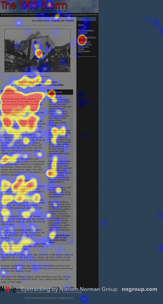
Nielsen Norman Group’s eye tracking research shows that people scan webpages and phone screens in various patterns, one of them being the shape of the letter F. Eye tracking visualizations show that users often read Web pages in an F-shaped pattern: two horizontal stripes followed by a vertical stripe. This isn’t random behavior it’s an efficient strategy user have unconsciously developed to process information quickly in our attention-scarce digital world.
The Anatomy of F-Pattern Scanning: In the absence of subheadings and bullets, users tend to fixate on the words toward the beginning of lines and toward the top of the page. This scanning behavior results in an eye tracking pattern that resembles the capital letter F. Think of it as your users’ survival mechanism for information overload they’re not being lazy, they’re being smart with their cognitive resources.
Detailed Behavioral Pattern: Research indicates that users predominantly focus on the upper part of a webpage or document, dedicating the most attention to the first few lines of text. The second horizontal movement is shorter, and the vertical movement down the left side is often a quick scan for additional information. This means users are constantly making micro-decisions about whether to invest more attention based on what they see in those crucial first moments.
Heat Map Evidence: NNGroup’s eye-tracking studies revealed that users (in left-to-right reading cultures) typically scan heavy blocks of content in a pattern that looks like the letter F or E. The areas where users looked the most are coloured red. The yellow areas indicate fewer views, followed by the least-viewed areas in blue. What’s particularly striking about these heat maps is how consistently they appear across different websites, demographics, and even time periods this is truly universal human behavior.
When F-Pattern Emerges: The F-pattern describes user behaviour when facing a text page without web-optimized formatting. This pattern emerges when users try to be efficient and aren’t committed to reading every word. Understanding this helps explain why well-structured SaaS pages with clear headings, bullet points, and visual hierarchy perform better than walls of text. You’re not fighting against user behavior you’re designing with it.
Contemporary Relevance: Eleven years after discovering this pattern, Nielsen Norman Group revisited what it means today and found it still relevant, even on mobile devices. However, the pattern is most pronounced when content lacks proper formatting and visual hierarchy. This gives us a powerful insight: good design can actually guide users beyond the F-pattern into deeper engagement.
Strategic Design Implications:
Place your most critical value propositions in the top-left quadrant where attention is guaranteed
Use the left sidebar or column for key navigation and conversion elements
Structure content with scannable headlines that draw the eye horizontally across the page
Understand that content in the middle-right of pages receives less attention (save supporting details for these areas)
Design mobile experiences that account for thumb-based F-pattern adaptations
The beautiful thing about understanding these patterns is that once you know them, you can design experiences that feel effortless to users. They don’t have to think about where to look or what to do next their natural cognitive patterns guide them exactly where you want them to go.
These three psychological principles serial position effect, cognitive load theory, and F-pattern reading form the scientific foundation for why certain web structures consistently outperform others across different industries, cultures, and device types. They’re not just design trends or personal preferences; they’re based on fundamental aspects of human cognition that remain constant regardless of technological advancement. Understanding them is the difference between designing websites that look good and designing experiences that actually work.
From Psychology to Practice
Now that we understand the psychological forces that govern how users interact with websites, the question becomes: how do we translate these insights into actionable design decisions?
The serial position effect tells us where to place our most critical information. Cognitive load theory shows us how to organize complexity without overwhelming users. F-pattern reading behavior reveals the optimal content hierarchy for maximum comprehension.
But knowing these principles is only half the battle. The real transformation happens when you apply them systematically to create a website structure that works with human psychology, not against it.
In the next part of this series, we'll dive deep into the practical application of these psychological principles. I'll walk you through the exact website structure that successful SaaS companies use – from strategic navigation architecture to conversion-optimized footer design. You'll see how companies like HubSpot translated psychological insights into billion-dollar businesses, and get the step-by-step framework to apply these same principles to your own SaaS website.