

The Hidden Curse of Beautiful Design and the 5 Products That Paid the Price
How stunning Product design and perfect aesthetics destroyed million-dollar companies

I was scrolling through LinkedIn yesterday when a post stopped me. The image was from reddit post I think. The caption? "Spent $300K on a healthcare app that nobody uses."
The founder's story was painfully familiar. They'd built what they thought doctors needed: a beautiful, feature-rich platform that solved problems they assumed existed. The app was flawless pixel-perfect design, smooth animations, an interface that would make any designer weep with joy. But they'd never actually asked doctors what they wanted. They'd never observed how doctors actually worked. They'd built their vision of the perfect healthcare app, not a solution to real problems.
Now they had a gorgeous, award-worthy product sitting unused, a testament to the dangerous gap between what we think users need and what they actually do.
That post sent me down a rabbit hole, thinking about all the beautifully designed products that have met similar fates. The design world is littered with these "beautiful graveyards" products so aesthetically stunning they earned industry acclaim, yet so disconnected from market reality that they hastened their creators' demise.
This phenomenon reveals something uncomfortable about our industry: sometimes our pursuit of design perfection blinds us to everything that actually matters for success. Here are five legendary examples that every modern startup should study not for their beauty, but for their expensive lessons.
1. When Perfect Design Meets Imperfect Assumptions
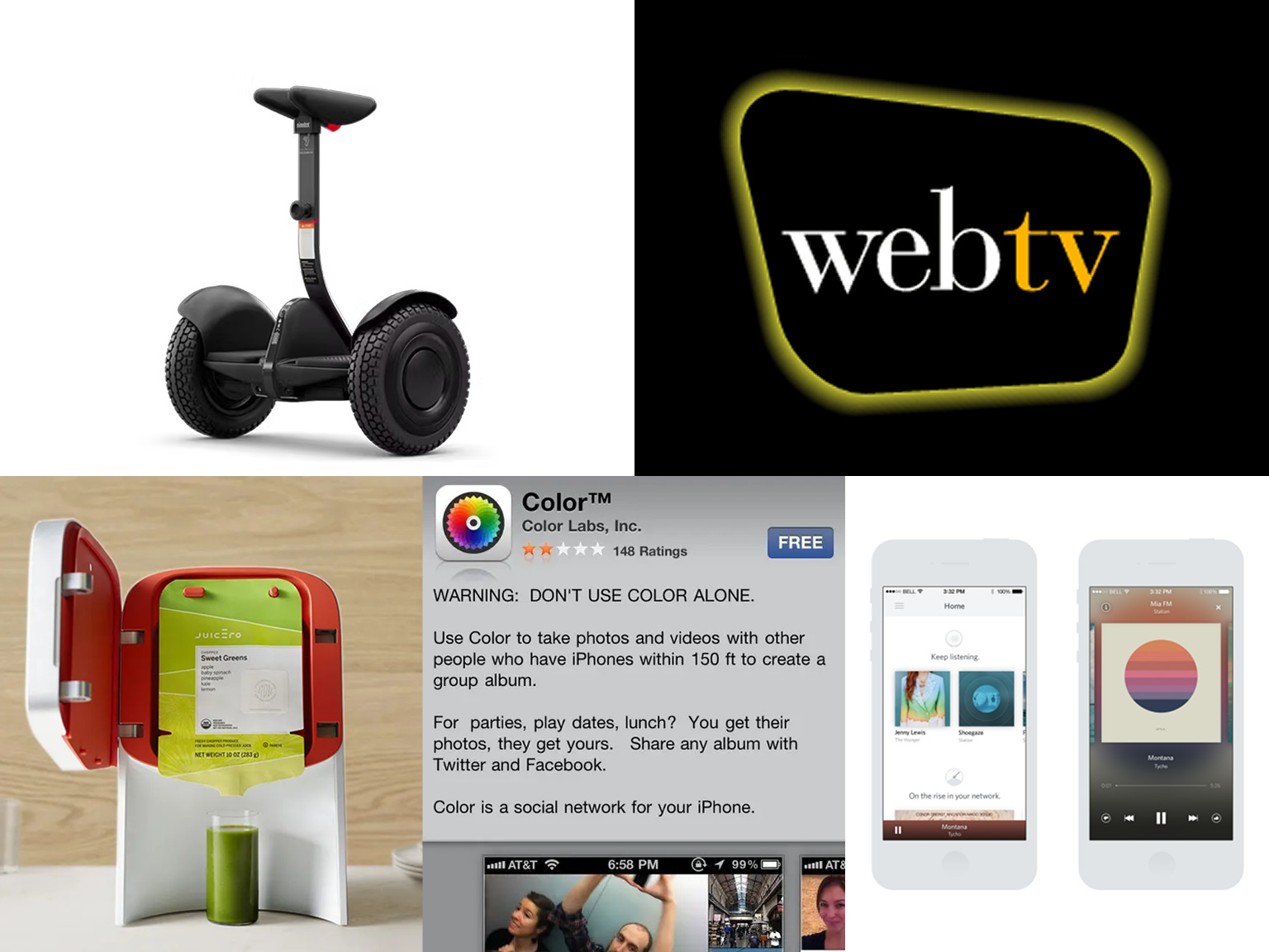
Dean Kamen's Segway Personal Transporter wasn't just a product it was a piece of industrial art. Launched in 2001 with unprecedented hype, the two-wheeled marvel earned design awards from institutions worldwide. Its minimalist form factor, sophisticated balance technology, and futuristic aesthetic made it a darling of design museums and technology exhibitions.

Everything about the Segway screamed thoughtful design. The clean lines suggested effortless mobility. The intuitive balance mechanism felt like magic. The industrial design was so compelling that it became an icon of early 2000s innovation, featured in movies and TV shows as shorthand for "the future."
But Kamen and his team had made the classic mistake: they'd built what they thought the world needed, not what the world actually wanted. The $5,000 price tag put it out of reach for casual users. Legal restrictions banned it from sidewalks in most cities. The learning curve was steeper than anticipated. Most damning of all, it solved a transportation problem that most people didn't actually have.
The Segway represented everything wrong with assumption-driven design. It was beautiful, functional, and completely divorced from user research, market validation, and real-world constraints. Segway Inc. never recovered from its initial market failure, eventually selling to a Chinese company before ending production entirely in 2020.
What modern startups should learn:
User research beats intuition: Beautiful assumptions are still just assumptions—validate them with real users
Solve existing problems, don't create new categories: Market education is exponentially more expensive than meeting known needs
Price for your actual market, not your ideal one: Premium design doesn't automatically justify premium pricing
Consider the full user journey: Great product experience includes purchase, setup, learning, and ongoing use
2. The Streaming Service That Chose Beauty Over Battle
While Spotify was fighting dirty in the streaming wars, Rdio was winning design awards. Launched in 2010, Rdio's interface was everything designers dreamed of—sophisticated typography, thoughtful color palettes, intuitive navigation, and album artwork that seemed to glow off the screen. Design blogs called it the most beautiful music service ever created.

Rdio's attention to aesthetic detail was obsessive. Every interaction felt crafted. The discovery features were elegant. The social sharing felt natural. The overall experience made listening to music feel like curating a personal art collection. Design publications couldn't stop praising its sophisticated approach to digital music consumption.
But while Rdio was perfecting pixel-perfect interfaces, Spotify was perfecting market domination. Rdio's team was made up of designers and music lovers who built what they wanted to use. They assumed that superior design would naturally lead to user adoption and market success. They were wrong.
Despite burning through $125 million in funding, Rdio never gained significant market share. The company shut down in 2015, selling its assets to Pandora for $75 million—essentially a fire sale that valued the beautiful design at a fraction of its development cost.
What modern startups should learn:
Design excellence doesn't guarantee market success: Beautiful interfaces need distribution strategies, competitive pricing, and network effects
Speed of iteration often beats perfection: While Rdio polished pixels, competitors captured users
Know your competitive landscape: Being the most beautiful player means nothing if you're also the smallest
Balance craft with growth metrics: Track user acquisition as obsessively as you track design quality
3. The $400 Lesson in Form Over Function
The Juicero wasn't just a kitchen appliance it was a work of art. This WiFi-connected juice press, backed by $120 million in venture funding, looked like it belonged in a design museum. Machined aluminum body, precision engineering, elegant proportions, and a user interface.

Design publications celebrated Juicero's minimalist aesthetic and premium materials. The device photographed beautifully. Its sophisticated presence made it a favorite among design-conscious early adopters. The industrial design was so compelling that it won features in architectural magazines and design blogs worldwide.
But Juicero's founders had fallen into the classic trap of designing for themselves rather than their market. They were affluent, health-conscious tech workers who valued premium design and didn't mind paying for convenience. They assumed their target market shared these values and purchasing power. They assumed wrong.
The $400 machine only worked with proprietary juice packs costing $5-8 each. When Bloomberg discovered you could squeeze the packs by hand with the same results, the illusion shattered. Juicero wasn't solving a juicing problem—it was solving a guilt problem for wealthy consumers who wanted to feel like they were living healthily without effort.
The company shut down in 2017, leaving behind warehouses full of beautifully designed, functionally pointless machines.
What modern startups should learn:
Validate core value propositions early: If your product can be replaced by human hands, you might have a problem
Design for real constraints, not ideal scenarios: Most users care more about results than aesthetic experience
Beware of designing for yourself: Your personal preferences might not scale to a sustainable market
Question fundamental assumptions constantly: "People will pay premium prices for premium design" isn't always true
4. When Beautiful Design Can't Fix Confusing Strategy
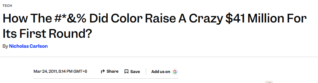
Color Labs arrived in 2011 with $41 million in funding and a photo-sharing app that was, undeniably, gorgeous. The interface was polished to perfection, featuring innovative social sharing concepts and a sleek, modern aesthetic that earned widespread praise from design critics and technology publications.
The design community loved Color's ambitious approach to social photography. Every screen was carefully crafted, every animation perfectly timed, every interaction thoughtfully considered. The app looked and felt like the future of mobile photography sophisticated, intuitive, and visually stunning.
But Color's beautiful design was wrapping a fundamentally confusing product concept. The app was supposed to automatically connect users in the same location to share photos, but the experience bewildered most people. Users couldn't understand why they were seeing strangers' photos or how the location-based sharing actually worked.

Color's team had built what they thought was an innovative solution to social photography. They'd assumed users wanted automatic, location-based photo sharing. They'd assumed the elegant interface would guide users through the confusion. They'd assumed their vision of social interaction matched what people actually wanted.
Despite the gorgeous interface, user adoption was dismal. Color Labs pivoted multiple times before finally being acquired by Apple in 2013, primarily for talent acquisition rather than product success.
What modern startups should learn:
Core functionality must be immediately understandable: Beautiful design can't compensate for confusing core concepts
Test assumptions with real users, not internal teams: What makes sense to builders might confuse actual users
Clarity beats cleverness: Innovative concepts need crystal-clear execution to gain user adoption
Watch user behavior, not just feedback: People might say your app is beautiful while never actually using it
5. Microsoft's Beautifully Timed Mistake
Microsoft's WebTV (later MSN TV) was a remarkably well-designed product that perfectly captured the late 1990s vision of internet-enabled television. The set-top box and its interface won industrial design awards for its sleek, consumer-friendly appearance and intuitive on-screen experience. The remote control was ergonomic perfection, and the overall system design was sophisticated enough to grace any living room.

Design publications praised WebTV's approach to making the internet accessible to mainstream consumers through television. The interface was clean, the interaction design was thoughtful, and the overall aesthetic represented a successful marriage of technology and user-centered design principles.
But Microsoft's team had made a crucial assumption about the future of computing. They believed consumers would prefer the simplicity of television-based internet access over the complexity of personal computers. They built an elegant solution to what they assumed would be the mainstream preference.
They were wrong about timing and user behavior. WebTV launched just as personal computers were becoming affordable and user-friendly enough for mainstream adoption. While WebTV offered elegant simplicity, consumers increasingly wanted the full flexibility of PC-based internet access.
Microsoft acquired WebTV for $425 million in 1997, but despite continued design refinements and awards recognition, the service never gained significant traction. MSN TV was finally discontinued in 2013 a beautiful solution to yesterday's problem.
What modern startups should learn:
Market timing can make or break perfect execution: Even great design can't overcome being too early or too late
User preferences evolve rapidly: What seems like a logical assumption today might be irrelevant tomorrow
Simplicity isn't always what users want: Sometimes people prefer complexity and control over elegant limitations
Monitor competitive alternatives closely: Your beautiful solution might be competing against rapidly improving alternatives
The Beautiful Truth About Building for Users, Not Awards
These beautiful graveyards share a dangerous common thread: they were all built by teams who assumed they understood their users without actually talking to them. Each product could have lived in a design museum from day one, but museums don't generate sustainable revenue or meaningful user adoption.
The healthcare app founder from LinkedIn learned this lesson the expensive way. Their $300K investment created something beautiful that solved problems doctors didn't actually have. Like all these examples, it represented the seductive trap of building what we think users need instead of discovering what they actually want.
This isn't an argument against good design quite the opposite. Companies like Apple, Tesla, and Airbnb prove that exceptional design can be a massive competitive advantage. But their success comes from design that serves validated user needs, not design that exists for its own sake.
The most successful products aren't always the most beautiful ones. They're the ones that solve real problems for real people in ways those people actually want them solved. Beauty is a multiplier, not a foundation.
Next time you're tempted to build something because it would look amazing in your portfolio, remember these beautiful graveyards. The greatest design achievement isn't winning awards it's creating something useful enough that people can't imagine living without it.
Everything else, no matter how gorgeous, is just another elegant headstone marking good intentions and expensive assumptions.