

The Universal SaaS Website Structure : From Navigation to Footer (Part 2)
Translating User Psychology into High-Converting Design Systems That Transform Visitors into Customers

This is Part 2 of my series on designing impactful SaaS websites. Part 1: The Psychology Behind Universal SaaS Website Design to understand the cognitive foundations that make these structures
Part 1: The Psychology Behind Universal SaaS Website Design
Now that we understand the psychological forces that govern how users interact with websites, the question becomes: how do we translate these insights into actionable design decisions?
The serial position effect tells us where to place our most critical information. Cognitive load theory shows us how to organize complexity without overwhelming users. F-pattern reading behavior reveals the optimal content hierarchy for maximum comprehension.
After analyzing hundreds of successful SaaS websites and working directly with clients across different industries, I've discovered something that might challenge conventional design wisdom: the most effective websites follow a surprisingly predictable structure. Not because they're copying each other, but because they've learned to speak the language of human psychology.
What makes this structure "universal" isn't that every SaaS website looks identical it's that the underlying information architecture aligns with how our brains naturally process, prioritize, and retain information. The companies that understand this don't just create websites; they create conversion machines that feel effortless to navigate.
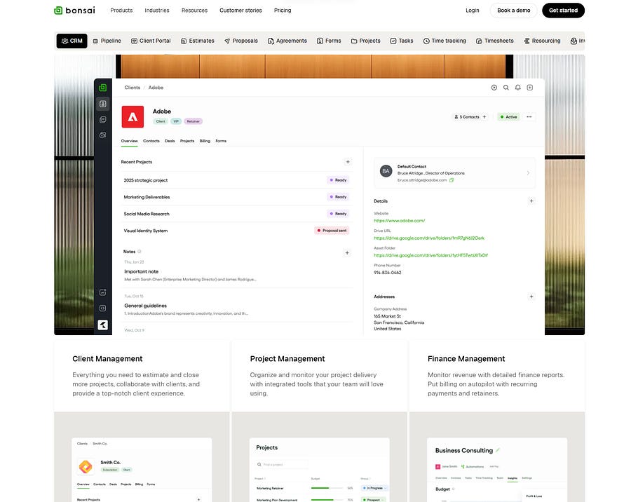
1. Strategic Navigation Architecture
Your navigation isn’t just a menu it’s the first impression users form about how organized and trustworthy your company is. The navigation serves as your website’s nervous system, and its structure can make or break user experience. Research from Nielsen Norman Group shows that effective SaaS navigation follows these principles, but the real magic happens when you understand the psychology behind the positioning:

Primary Navigation (5–7 main categories maximum):
Product/Solutions (always first after logo) — Users expect to understand what you do before anything else
Pricing (positioned based on sales strategy) — Self-serve products put this second; enterprise solutions often hide it until users are qualified
Resources/Learn (builds authority) — This isn’t just helpful content; it’s trust-building real estate
Company/About (trust-building) — Humans buy from humans, even in B2B
Contact/Demo (conversion-focused) — Your primary conversion gateway
Secondary Navigation Elements:
Login/Sign Up (top-right corner) — Users’ eyes automatically look here; fighting this expectation creates friction
Language/Region selector (if applicable) — Global accessibility signal
Search functionality (for content-heavy sites) — Reduces cognitive load for power users
The Navigation Hierarchy Rule: Place your most conversion-critical pages (Demo, Free Trial, Pricing) in positions 2, 3, or at the far right of your navigation. Users’ eyes naturally gravitate to these spots due to the serial position effect we discussed earlier.
2. Your 8-Second Emotional Hook
Here’s what three years of client work has taught me: you don’t just have 8 seconds to explain what you do you have 8 seconds to make users feel something. The most successful SaaS websites lead with emotion, then back it up with logic.
Emotionally Intriguing Website Messaging: Instead of starting with features or benefits, the best SaaS heroes begin with the emotional state users want to achieve. “Finally, project management that doesn’t make you want to quit” hits differently than “Advanced project management software with 50+ integrations.”
he universal hero structure that consistently performs combines emotional resonance with clear value communication:
Value Proposition Hierarchy:
Primary Headline (1 line): Emotional outcome + What you do + Who it’s for
Sub-headline (2–3 lines): How you solve their specific pain point (the process)
Social Proof Element: Customer logos, user count, or achievement badges
Primary CTA: Action-oriented, contrasting color
Secondary CTA: Lower commitment option (Watch Demo, Learn More)
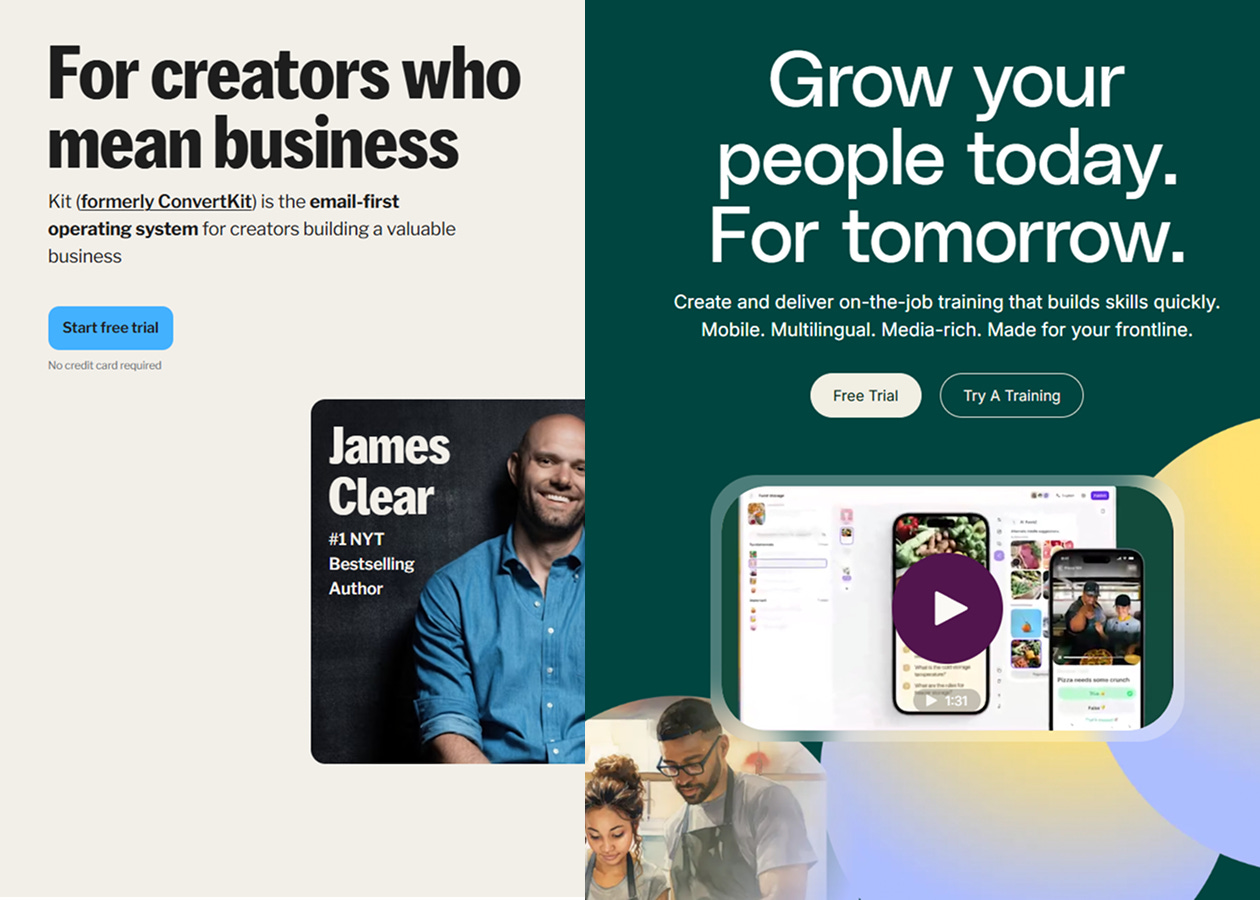
Hero Visual: This is where strategy meets psychology


Video Explanation in the Center: After working with dozens of SaaS clients, I’ve found that product demo videos in the hero section can increase conversion rates by 40–60%. But here’s the key: the video shouldn’t just demonstrate features it should tell the story of transformation. Users don’t buy software; they buy better versions of themselves.
Position your product video centrally in the hero, but make it feel like a natural extension of your messaging, not an interruption. The video should answer the question your headline creates.
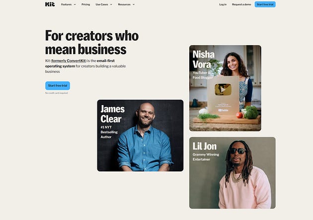
Images vs. Illustrations: Illustrations were everywhere in 2022. Every SaaS website had beautiful, custom illustrations that looked fantastic in design portfolios. Then something interesting happened when I started tracking actual client results: websites with real images real people, real screenshots, real working environments consistently outperformed their illustrated counterparts in user engagement and conversion rates.
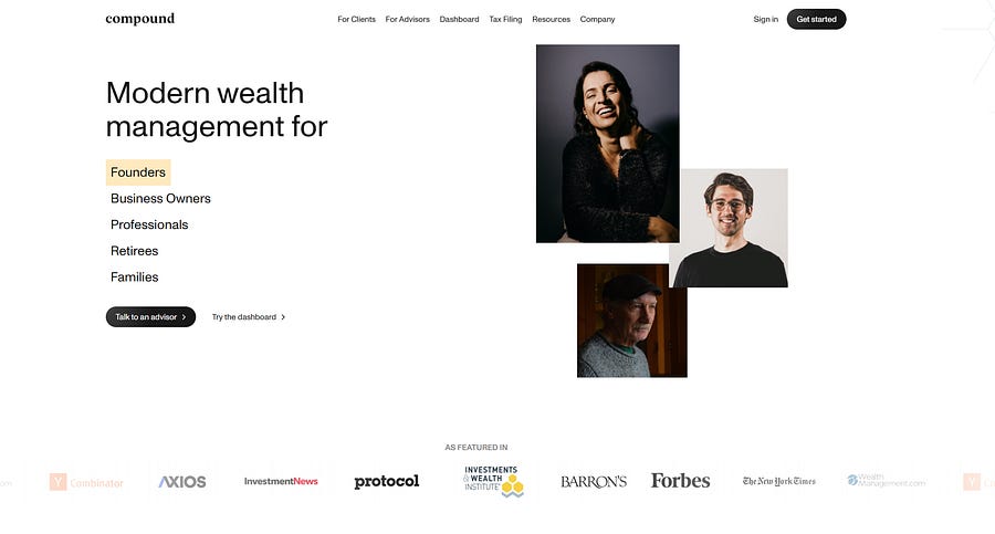
After diving deeper into client feedback and user testing, the reason became clear: illustrations feel designed, but images feel real. When someone is considering spending thousands of dollars on software for their business, they want to see proof that real people use and benefit from it. Illustrations, no matter how beautiful, create psychological distance. Images create connection.
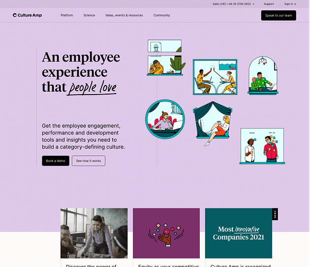
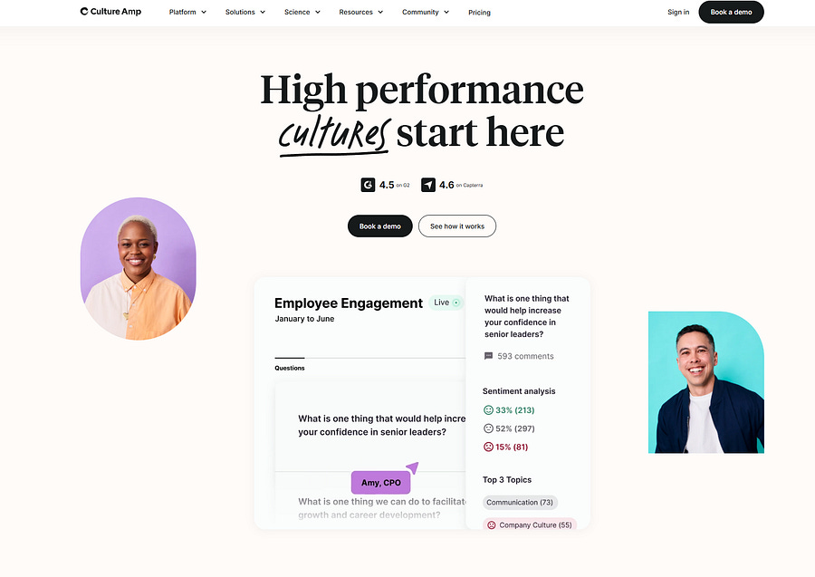
This doesn’t mean illustrations are bad they work beautifully for brand identity and supporting graphics. But for your primary hero section, pricing pages, and testimonial sections, real images build more trust and drive more conversions.
The 5-Word Rule: Your primary headline should be understandable when reduced to 5 words or less, but it should make users feel something even before they fully comprehend it.
3. Building Immediate Credibility Through Authentic Validation
Social proof isn’t just about showing logos it’s about removing risk from the user’s decision-making process.

The most effective social proof sections combine multiple proof types to address different psychological concerns:
Logo Wall: 6–12 recognizable client logos (but choose quality over quantity)
Metrics: Specific numbers that matter (users served, money saved, time recovered)
Testimonial Preview: One compelling quote with photo and company
Industry Recognition: Awards, certifications, partnerships
Authentic Testimonials That Actually Convert: Here’s where most SaaS websites get testimonials completely wrong. A quote with a name and company title can be fabricated by anyone in five minutes. After years of testing different testimonial formats, I’ve found that authentic social proof requires multiple verification layers:
Google Reviews Integration: Direct embedding of Google Business reviews shows verified feedback
LinkedIn Testimonials: LinkedIn recommendations carry more weight because they’re tied to real professional profiles
Video Testimonials: The highest-converting testimonial format because it’s hardest to fake and builds real human connection
Specific Results: Instead of “Great product!” use “Reduced our customer onboarding time from 3 weeks to 3 days”

The goal isn’t just to show that people like your product it’s to show that people like your product enough to put their professional reputation behind it publicly.
4. Problem-Solution Architecture
This section transforms visitors from casual browsers to engaged prospects by creating problem awareness and positioning your solution as inevitable. Structure this as a story of transformation rather than a list of pain points and features.
The Universal Problem-Solution Flow:
Current State: How users currently handle the problem (painfully, inefficiently, with multiple tools)
Consequences: What happens if they don’t solve it (missed opportunities, team frustration, lost revenue)
Desired State: The transformation your product provides (the promised land)
Proof: Specific examples of this transformation in action
5. Full Feature Explanation Without Overwhelming Users
The biggest mistake I see SaaS websites make is feature overload. Users don’t need to see every capability upfront they need to understand the core value, then progressively discover additional capabilities as they become more interested.
Avoid Bento-Style Everywhere: Bento box layouts became popular because they look clean and organized, but they’re not always the best choice for feature presentation. Use bento-style layouts when you have features of equal importance that work together as a system. But when you have hero features that drive conversions, give them the space and attention they deserve with dedicated sections.
The Three-Tier Feature Model: Tier 1: Core Value Features (3 maximum)
The primary reasons users choose your solution
Each feature gets dedicated visual treatment with real screenshots
Focus on outcomes, not functionality (“Save 10 hours per week” not “Automated reporting”)
Tier 2: Competitive Differentiators (3–5 features)
What sets you apart from alternatives
Often technical capabilities presented in user-friendly language
Perfect for bento-style presentation
Tier 3: Table Stakes Features (listed, not explained)
Basic functionality users expect
Mentioned for completeness, not emphasized
Can be included in a simple grid or list format
6. Pricing Strategy Integration
Your pricing page structure should align with your sales motion, but transparency should be non-negotiable:
Product-Led Growth Approach:
Freemium tier prominently featured
Clear upgrade path visualization
Self-service emphasis with immediate access

Sales-Led Approach:
“Contact Sales” as primary CTA, but still show starting price ranges
Enterprise features highlighted
Custom pricing with transparent criteria
7. Trust and Security Reinforcement
Especially critical for B2B SaaS, position trust elements strategically throughout the user journey:
Security Certifications: SOC 2, GDPR compliance, industry-specific standards
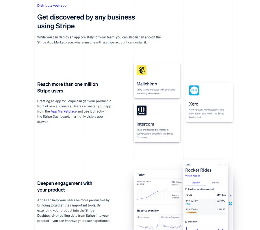
Integration Showcase: Popular tool connections that users already rely on
Implementation Support: Clear onboarding process and support commitments
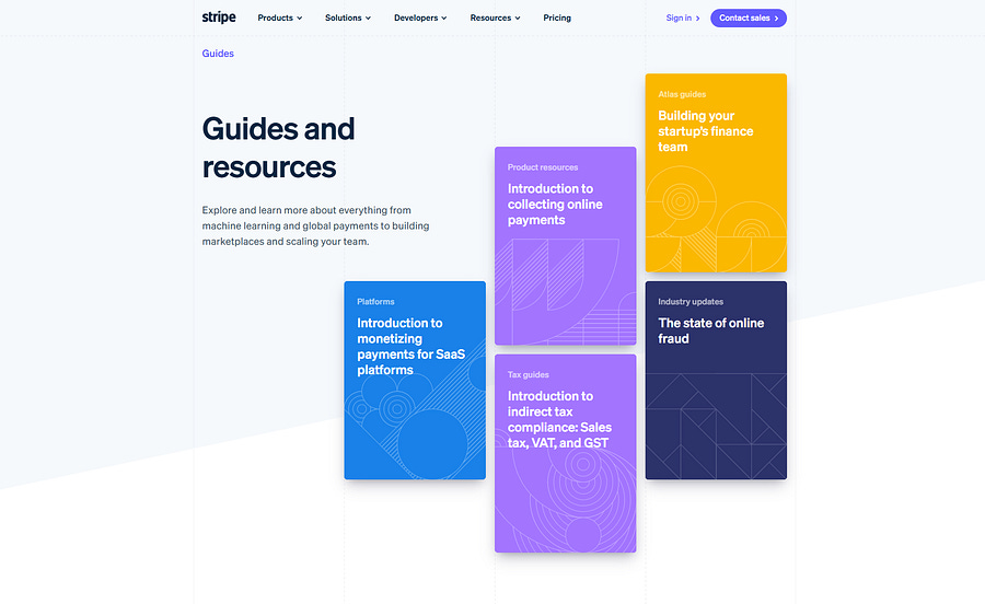
8. Invest in Blog Posts for SaaS Product Growth
One of the most undervalued aspects of successful SaaS websites is their content strategy. Companies that invest seriously in blog content see 3–5x more organic traffic and significantly higher conversion rates. But this isn’t just about SEO it’s about building genuine expertise and trust.
I remember studying HubSpot’s early days when I was trying to understand how some SaaS companies seem to come out of nowhere and dominate entire industries. What I discovered completely changed how I think about content strategy.

Back in 2006, HubSpot had a problem that many startups face: they were selling something that people didn’t even know they needed. Marketing automation software wasn’t really a thing yet, and most businesses were still thinking about marketing as billboards and cold calls. Instead of fighting this uphill battle with traditional advertising, they made a brilliant decision: they would teach their market how to think differently about marketing altogether.
Their blog became something different from what we typically see in SaaS. Instead of writing “10 Features You’ll Love About Our Software,” they published articles like “The Comprehensive Guide to Understanding Your Customer’s Journey” and “Why Traditional Marketing is Broken (And What To Do About It).” They weren’t selling their product — they were selling a new way of thinking.
The genius part? They coined and popularized the term “inbound marketing” through their content. They literally created the language that their entire industry now uses. Every time someone searches for inbound marketing education, HubSpot is there as the authoritative source.
Fast forward to today: HubSpot’s blog attracts over 7 million monthly visitors, their company is worth over $31 billion, and they’ve become synonymous with modern marketing. But here’s what most people miss about their success it wasn’t just about creating great content. Every single article was strategically designed to move readers through a specific journey: first, make them question their current approach, then educate them on better methods, and finally, show them that HubSpot’s software makes those better methods possible.
They didn’t just build a blog; they built a education-to-conversion machine that turned content readers into customers at scale
Strategic Blog Post Categories:
Industry Insights: What’s changing in your users’ world
Problem-Solving Guides: Tactical solutions to user challenges
Product Education: How to get maximum value from your solution
Customer Success Stories: Real transformation examples
Thought Leadership: Where your industry is heading
Resource and Content Hub Structure: Your resources section should serve multiple user journey stages:
Awareness Stage: Industry insights, trend reports, problem identification content
Consideration Stage: Comparison guides, ROI calculators, evaluation frameworks
Decision Stage: Implementation guides, case studies, success metrics
Retention Stage: Best practices, advanced tutorials, community building
Learn or Guide Page Should Be a Priority: The most successful SaaS companies treat their educational content as a product in itself. Your learn/guide section shouldn’t be an afterthought it should be a destination that provides genuine value even before users become customers.
Structure your learning hub like a curriculum:
Getting Started: Fundamental concepts and quick wins
Intermediate Guides: Process improvement and optimization
Advanced Strategies: Power user techniques and integrations
Industry-Specific Applications: Tailored approaches for different verticals
9. Footer Architecture
Most designers treat footers as afterthoughts, but they’re prime real estate for users who’ve scrolled through your entire page they’re your most engaged prospects.
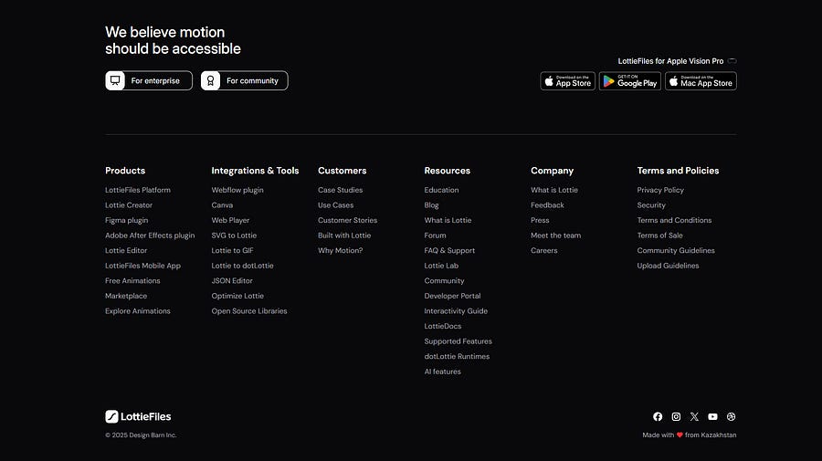
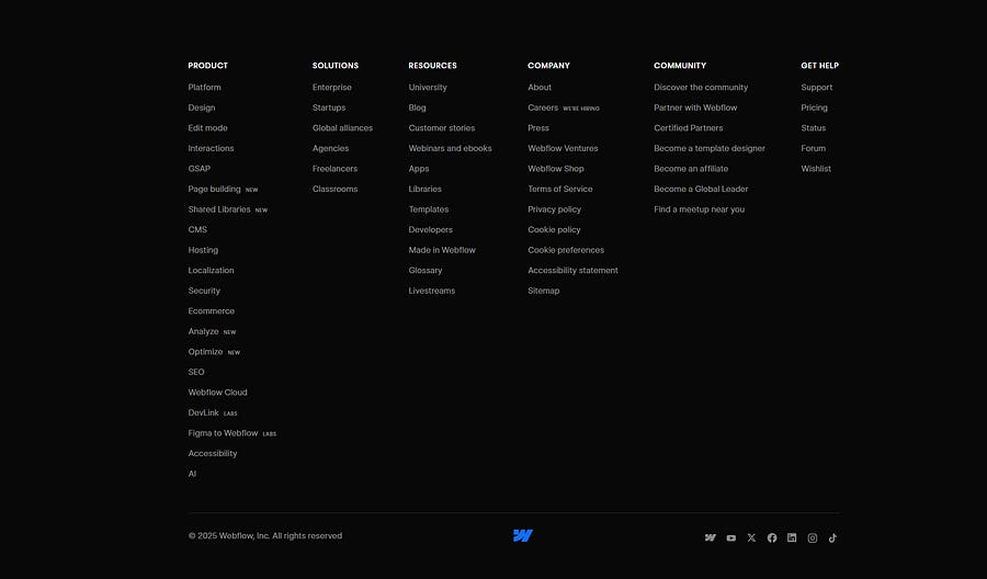
Universal Footer Structure:
Column 1: Company Reinforcement
Logo and brief mission statement
Contact information that builds confidence
Social media links (but only to active, professional profiles)
Column 2: Product Navigation
Core features overview
Pricing link
Free trial/demo CTA (different angle than primary CTAs)
Column 3: Resources and Support
Documentation and learning resources
Customer support channels
Community links and user forums
Column 4: Legal and Trust
Privacy policy and terms of service
Security information and certifications
Compliance badges
Footer CTA Section: One final conversion opportunity with a different angle than your primary CTAs. Users who reach your footer are highly engaged give them a compelling reason to take action.
The Iterative Approach
Don’t attempt to implement this entire structure at once. Instead, follow a strategic rollout:
Phase 1: Navigation and hero section optimization
Phase 2: Social proof and problem-solution refinement
Phase 3: Feature presentation and use case development
Phase 4: Trust elements and footer optimization
The Human Connection
While this universal structure provides the framework, remember that impactful design goes beyond following templates. The most successful SaaS websites use this structure as a foundation but infuse it with their unique brand personality, authentic customer stories, and genuine empathy for user challenges.
The goal isn’t to create a website that looks like every other SaaS platform it’s to create a digital experience that feels both familiar enough to navigate intuitively and unique enough to be memorable.
Structure as Creative Foundation
The universal structure of impactful SaaS websites isn’t a constraint on creativity it’s a foundation that amplifies it. By understanding and implementing these research-backed principles, you create space for innovation within a framework that consistently drives results.
Remember, users don’t visit your website to admire your design skills. They come with problems to solve and goals to achieve. The most impactful websites are those that use universal structural principles to guide users effortlessly toward solutions while building genuine connection and trust along the way.
The wow factor isn’t about flashy animations or cutting-edge aesthetics it’s about creating an experience so intuitive, valuable, and human that users can’t imagine choosing anyone else.